Maybe a better way to go about doing it, MacDonald's!
My opinion on the effectiveness of the infographics on the McDonald's© UK's, Hash Brown's pouch
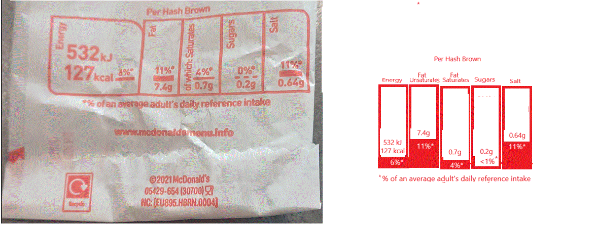
Purpose
| Business Requirement | Relevant Data |
| Mandatory to declare nutrition information by law. |
refer: food.gov.uk |
Merits of the Proposal
| Original Visual | Proposed Visual |
| Ticks the box for compliance. (May be the business wants just that, in that case, the purpose is served well.) | In addition to enabling compliance with regulation, informs consumers about the nutritional value of a Hash Brown, instinctively. |
| Ambiguity due to bad labelling( 'of which saturates' - does the percentage with respect to the combined quantity of unsaturates and saturates? Not sure!) | Separted the visuals making the labelling clear. |
| Unnecessary visual element like the underline on the percentage(what insight into the data does it provide? None!). | Instead of the unnecessary underline visual element, shading is given in the bar chart, to compliment the average daily intake to per hash brown nutrition percentage number. |